Skip to content
/
Global
Middle East
Jordan
UAE
X
About Us
Services
Experience Real Results
Partner with Blueline SEO and
scale your business.
SEND MY FREE PROPOSAL
SEO
SEO Consulting
Local SEO
International SEO
Franchise SEO
Website SEO Audit
Reputation Management Services (ORM)
Pay per Click Advertising (PPC)
Google Ads
Youtube Ads
Franchise PPC
E-Commerce PPC
Social Media Marketing
Facebook Marketing
Instagram Marketing
Linkedin Marketing
Pinterest Marketing
TikTok Marketing
Snapchat Marketing
E-Commerce Marketing
E-Commerce SEO
Shopify PPC
Shopify SEO
Content Marketing
SEO Content Writing
Email Marketing Services
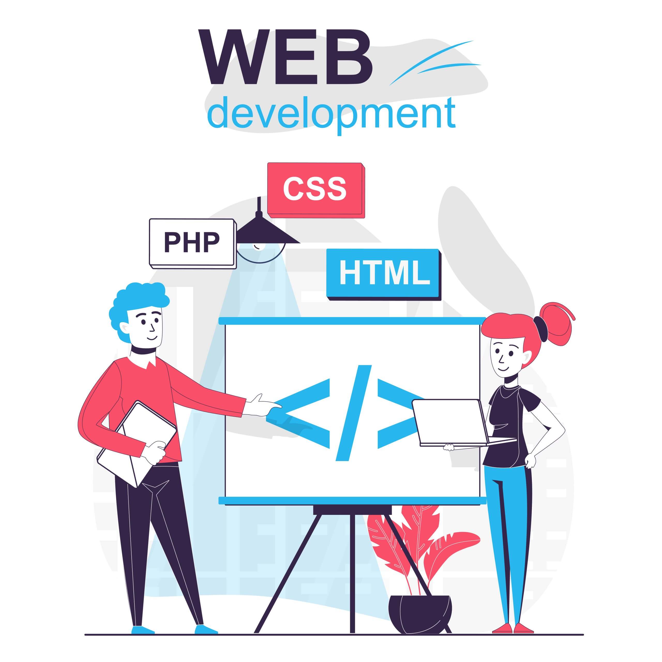
Web Design & development
Wordpress Development
E-Commerce Web Development
Website Maintenance
Corporate Branding Services
Mobile Apps Development
CRO Audits
CRO Audit
Landing Page Design
UX Testing
AI Solutions
Chatbot Development Services
AI SEO
Sectors we Serve
Real Estate Industry
Food and Beverage
Healthcare Industry
Educational Industry
Health and beauty
Travel and Tourism
Hotels
Automotive Industry
Case Studies
Blogs
Careers
Get a Free Quote
X
E-commerce Web Development
Web design & development
How UX Affects the Success of Jordanian Websites and How to Change SEO to Fit
Read More
13 November, 2025
E-commerce Web Development
,
SEO Services
,
Social Media Marketing
,
Web design & development
Expert Digital Marketing Consultation Services
Read More
13 November, 2025
E-commerce Web Development
Franchise SEO VS PPC for franchise growth
Read More
13 November, 2025
E-commerce Web Development
How to Create Irresistible E-Commerce Landing Pages
Read More
13 November, 2025
Web design & development
The Future of Tech and Web Development in Jordan 2025
Read More
13 November, 2025
E-commerce Web Development
,
SEO Services
,
Social Media Marketing
,
Web design & development
Top Digital Marketing Agency in KSA
Read More
13 November, 2025
E-commerce Web Development
,
SEO Services
,
Social Media Marketing
,
Web design & development
Best Local SEO Agency in Dubai | Top SEO Experts
Read More
13 November, 2025
Table of Contents
×
Why Your Business Needs a Partner in Digital Marketing?
Why it’s important to have localized marketing strategies?
How do We Localize?
Why Blueline SEO is the Best Digital Marketing Company in Riyadh?
1. Experience and Results That Work
2. Strategies Based on Data
3. New ideas and technology
Our Digital Marketing Solutions That Do Everything
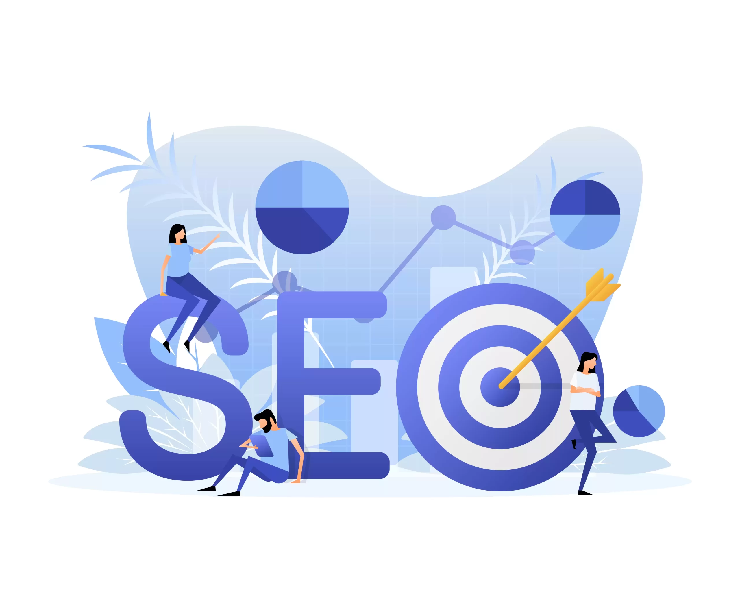
Search Engine Optimization (SEO)
Managing Social Media
Marketing through influencers and affiliates
Web Design and Development
Why You Should Work with a Riyadh Marketing Agency Like Blueline SEO?
Knowledge and Tools
Solutions that are cheap and easy to grow
More leads and more visibility for your brand
Better customer engagement
How to Pick the Best Digital Marketing Company in Riyadh?
Digital Marketing Trends That Are Starting to Show Up in Saudi Arabia (2025)
Artificial Intelligence and Automation
Optimizing for Voice Search
Video and influencer marketing
Work with Blueline SEO, your growth partner in Riyadh
Why choose Blueline SEO?
→
Index
WhatsApp us
Optimized by Seraphinite Accelerator
Turns on site high speed to be attractive for people and search engines.

 Skip to content
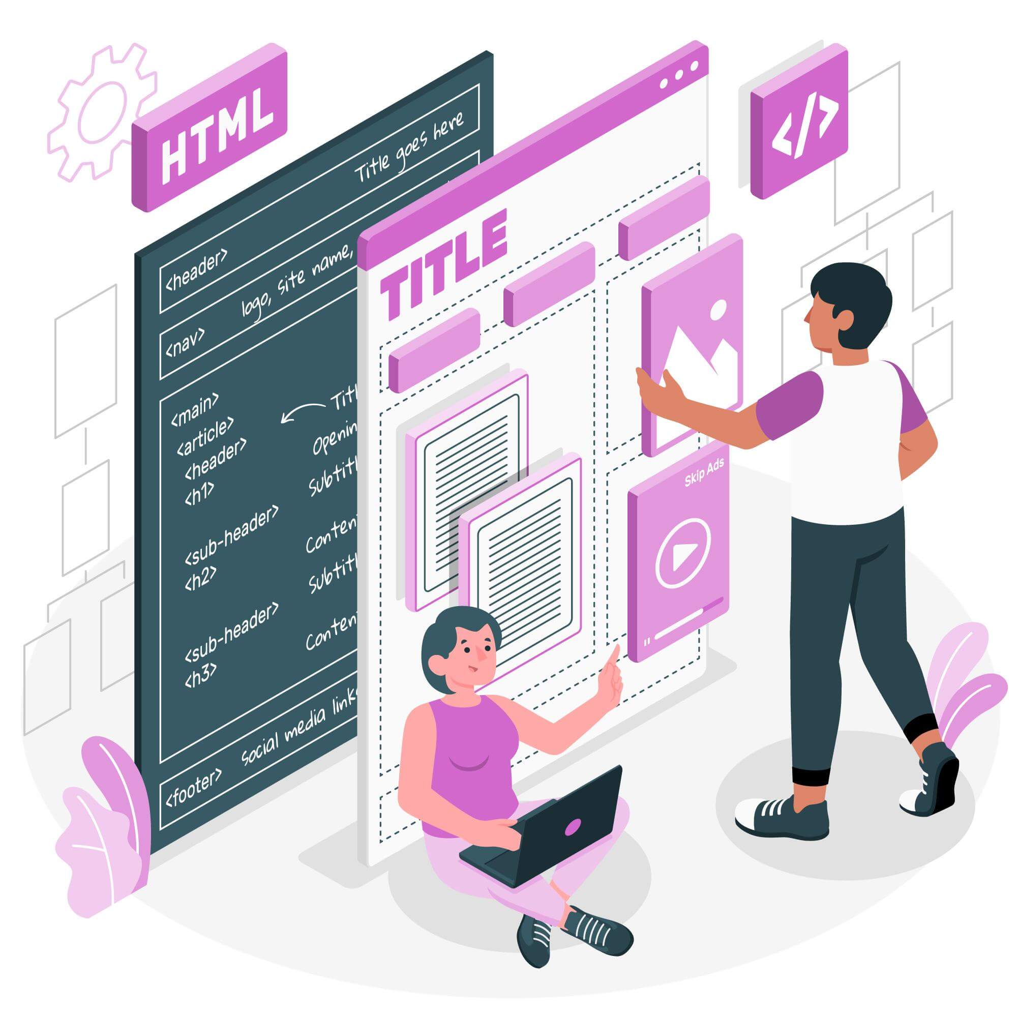


 Optimized by Seraphinite Accelerator